by John Hartshorn, Yorkshire Rewilding Network Trustee
24th November, 2022
What is a map?
Most people tend to think of maps primarily as reference pictures of places and the stuff that connects those places – roads, railways – with perhaps a few nicely shaded areas and symbols that allude to the other stuff in the area covered by the map: towns, rivers, lakes, woodlands, youth hostels, contours… I imagine that you might have just conjured up an image in your head of an Ordnance Survey Explorer Map or perhaps one of the online map services from the likes of Google or Bing. But a map is really much more than that. As with many things, context is everything.
Maps are used to depict a huge amount of information on an almost infinite range of themes, which can be real-world or abstract. They put that information into the context of place and time and, when well designed, maps are a form of visual representation that is far more intuitive to us. Why? It’s because our brains are hard-wired to recognise relationships and patterns visually and spatially. The old adage says that “a picture is worth a thousand words”. This essentially means that complex and sometimes multiple ideas can be more effectively conveyed in a single picture or image rather than as a verbal or written description, list, or spreadsheet. Maps are such pictures. They tell us the extent, scale, and connectivity of something and show us the distribution, relationships within and between, and patterns of whatever it is that they are visually representing. Location is also the best form of reference for integrating information from a wide range of individual sources and disciplines that all relate to that location, whether the information is about natural and physical, economic, or human and social aspects of the location. So, what is the relevance of this to rewilding?
Rewilding is fundamentally about the restoration of ecosystem processes, function, and overall ecosystem integrity across all scales from small-scale local, through landscape scale, and eventually up to the planetary scale. It is really a type of ecological engineering in which we undertake planning and, initially at least, management with the intent of restoring complexity and natural dynamics, improving biodiversity and bio-abundance, and generally increasing the benefits to humans that we get from nature. Rewilding is about joining up and expanding bits of nature, rather than fragmenting them further. This means that geographical extent, or scale, and connectivity across an area are important when it comes to overall ecosystem integrity. What does this look like when presented on a map?
Take the following graphic, for example, by Carver et al (2021). It shows how connectivity is achieved in an area (of unknown scale) through the joining up of high ecosystem integrity “core” areas by landscape corridors and smaller “stepping stones”, both of which also show relatively high levels of ecosystem integrity, in an otherwise lower-integrity human-modified landscape.
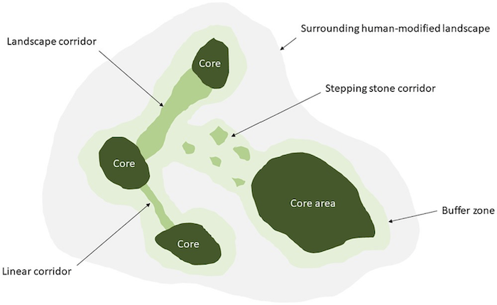
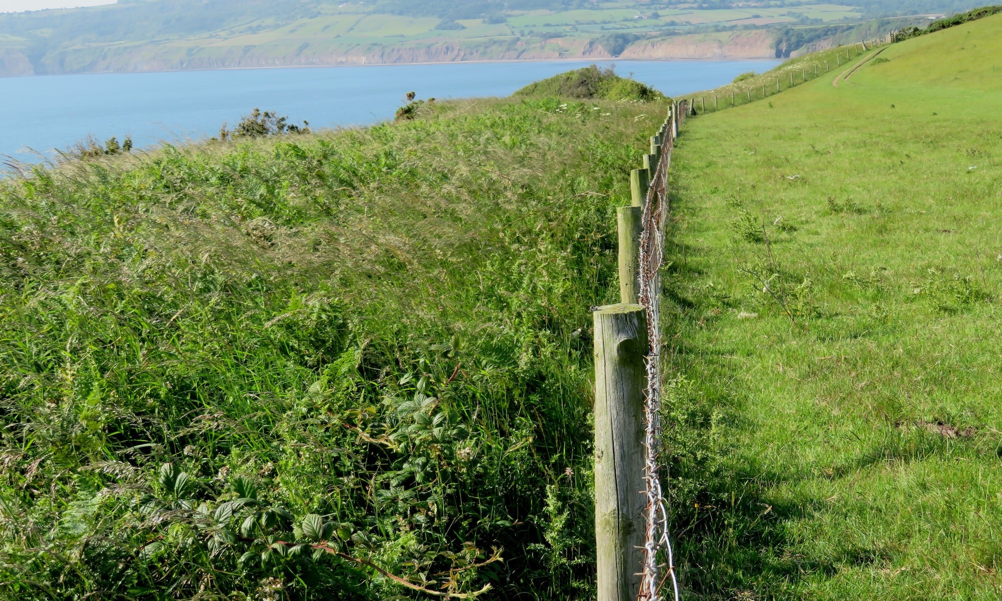
The corridors and stepping stones help species disperse and expand their range. Buffer zones also allow core areas to expand. What does this look like for an approximately 75ha site in Yorkshire that is currently heading along a rewilding trajectory?
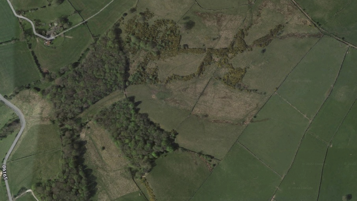
Here’s the site without any thematic information displayed on it…
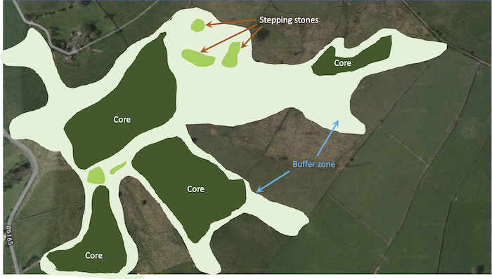
And here is a very simple mapping exercise showing the basic connectivity of habitats at the site using Carver et al’s (2021) model…
It will come as no surprise to you that rewilding projects use maps extensively as their primary means of planning, recording, monitoring, reporting, and presenting site specific information. There are many reasons why such projects undertake mapping. It might be to record a baseline, or starting condition, of the geology, soil types, or habitats and their extents across the site. Or it might be to record the observed locations of species from biodiversity and other ecological surveys. Future surveys can then add to the baseline to show changes over time. A map might be used to plan a project, showing the current layout of a site, what projects will be undertaken and where, and how the project might look at some future point. Public information might be presented using a map of the site, or the map might show the economic values of natural “assets” for use in assessments of “natural capital” or the flows, both physical and monetary, of “ecosystem services”.
Maps are not static when used in projects in the ways I’ve described. They are dynamic in that they can show a theme’s data values or attributes at specific locations for a specific point in time, or show changes in those values or attributes between points in time. In other words, the graphical representation of information on the map is entirely driven by and dependent on the data stored against each geographical object on the map – whether it be a field, an area of woodland, or a single-point survey location. We can also derive new map themes by undertaking geographical queries and analysis on the map data that we have for the project.
When maps are dynamic in this way, they usually need some specialist digital mapping software to organise, structure, manage, and then visualise and analyse the information. Such software is usually referred to as a Geographic(al) Information System or “GIS” for short. You will also often see the word “geospatial” used interchangeably with “geographical”, or even just “spatial” on its own, although that doesn’t strictly relate to the surface of the Earth. The underlying reference maps are typically from the likes of the Ordnance Survey, OpenStreetMap, or from providers of aerial photography or satellite imagery. The more specific thematic information layers are usually the outputs from a range of different methods and technologies used to capture raw data for a specific theme. The methods range from basic field survey recordings made directly on to the map (be it paper or digital) or into a GPS device, through remotely-sensed information (such as from satellites or aerial photography), or as data captured by drones, acoustic sensors, camera traps, and environmental DNA samples. There are many more ways to capture raw data that can be related to location and once you have your data, you can combine it and query it to derive new data. This might just be to produce simplified data for a theme or perhaps an entirely new thematic map “layer” that is the product of extracting data from one layer and combining it with data from another layer.
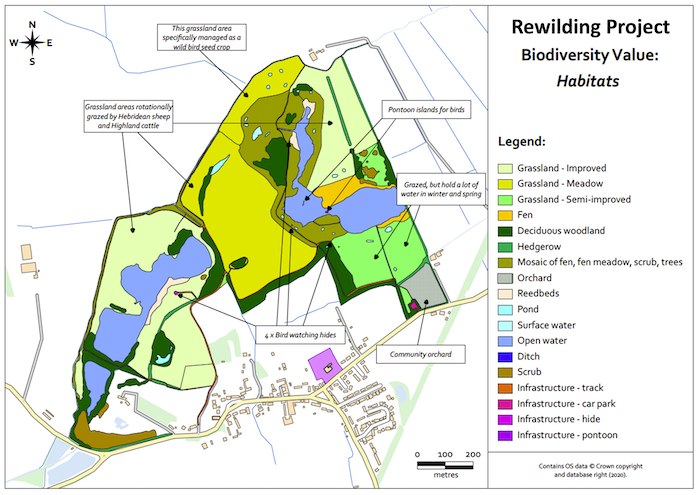
Below are a few maps that might be produced for a new rewilding project.
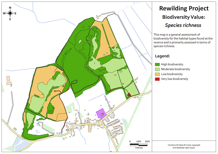
The first 2 maps indicate biodiversity value for the project, the 1st being a baseline assessment of habitats…
…and the 2nd being a map of species richness…
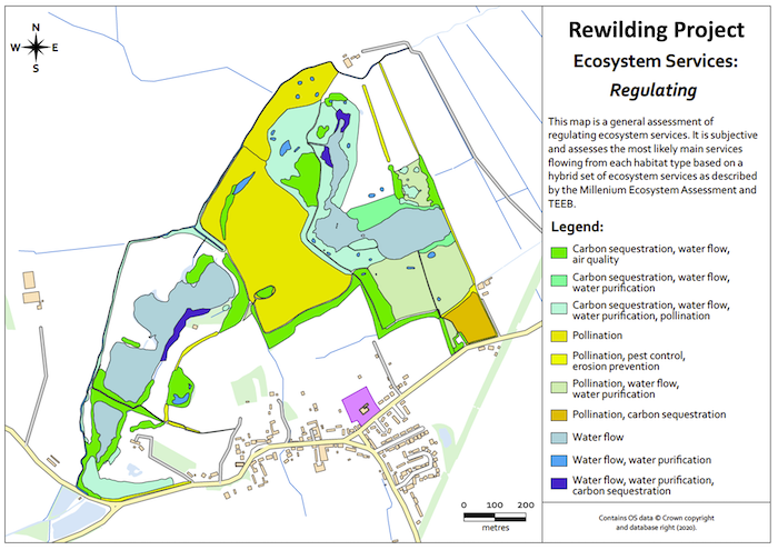
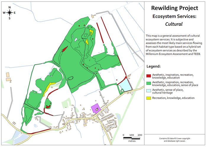
There are then 2 maps below which show assessments of certain “ecosystem services”, which are the various benefits to humans provided by the natural environment and from healthy ecosystems. The first map shows “regulating” ecosystem services at the site…
…and the second map shows “cultural” ecosystem services at the site, which are all of the non-material benefits we get from nature, such as from the enjoyment and recreational, spiritual, physical, mental, and social wellbeing that humans enjoy from the site.
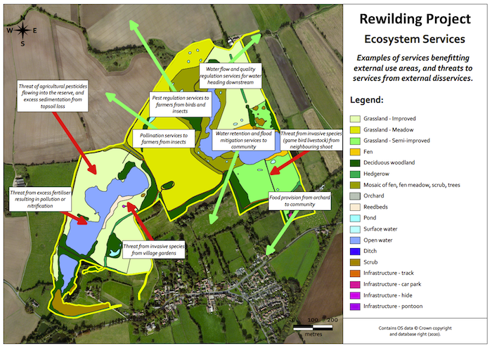
The following map shows how “ecosystem services” flow out from the site and benefit the surrounding area, but also how some “disservices” flow in to the project site from the surrounding farmland and gardens…
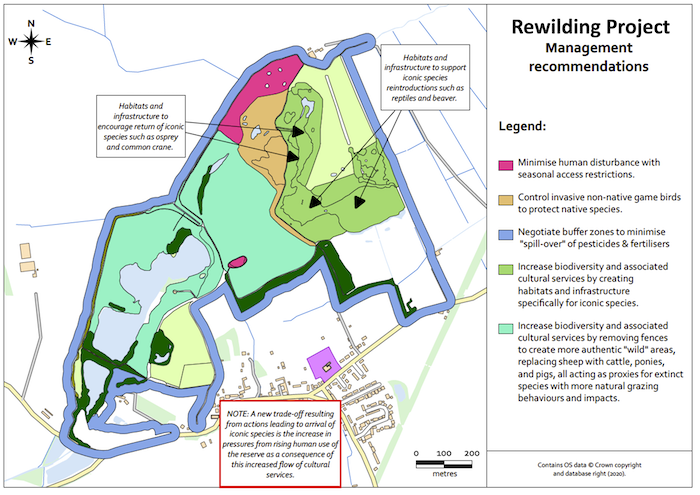
This final map shows some recommendations for managing different parts of the project site in order to improve the biodiversity and “ecosystem services”…
If you are undertaking a rewilding project, whether it be planning one, surveying a site to produce an initial view of the site (often described as a “baseline”), monitoring and recording changes over time, or providing information to others about the project or site, there’s a good chance you might need to produce some maps. You might produce a map of the initial conditions, or “baseline”, of your site. This will take the form of a habitat map and will most likely use a standard classification system such as a Phase 1 Habitat Survey or a one based on the UK Hab classification system. You might need a map that shows natural capital and physical and monetary valuations of the flows of certain ecosystem services. You might be working on a site or project that is involved in providing Biodiversity Net Gain (which uses the UK Hab classification system) or another form of “offsetting” for development projects or companies seeking to invest in nature. From a purely ecological perspective, you might want to produce a habitat suitability map for specific species or simply keep an inventory of species and habitats present across the site and how that changes over time.
There are a number of options when it comes to digital mapping, or GIS, software tools, and they range in price from “free and open source” to rather expensive. Of course, that’s a bit subjective – it all depends on the value you ultimately get from the software and data that you invest in.
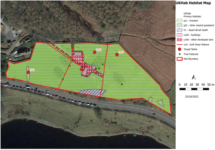
QGIS is perhaps the best known of the free options. It’s very comprehensive, being developed and maintained by a huge global community of geographers and software developers who give their time for free. Many commercial organisations, public sector, and non-government organisations (NGOs) even use QGIS, such is its capability and track record. Indeed, many jobs specifically aimed at attracting geographers will specify QGIS experience in the list of ideal skills. And that, I’m afraid, is a bit of a clue – digital mapping and GIS overall is quite a technical subject for which many geographers, ecologists, and other environment professionals undertake specific training at post-graduate level. However, the basics are quite straight forward and there are books and online training content to get you up and running with QGIS. The image below shows a site which has been mapped as part of a training course that shows how to produce a baseline habitats map in QGIS using the UK Hab classification system.
A far more purpose-specific, template-based approach to mapping a project site is offered by The Land App. This app is hosted online and provides linkages to a number of useful datasets available at little or no cost. If you’re looking at relatively simple mapping needs, this might be a tool for you and one that probably doesn’t require the skills associated with a tool such as QGIS.
Two last things to ponder…
- Good cartographic design is critically important to communicating the information you wish it to convey and how your map will be interpreted and used.
- You can lie very well with maps.
References:
Carver, S, et al. (2021). Guiding principles for rewilding. Conservation Biology. 2021; 35: 1882− 1893. https://conbio.onlinelibrary.wiley.com/doi/10.1111/cobi.13730
Monmonier, M. (2018). How to Lie with Maps. Third Edition. ISBN-13 978-0226435923
Soulé, M. E., & Noss, R. (1998). Rewilding and biodiversity: Complementary goals for continental conservation. Wild Earth, 8(3), 18–28. Available from here.
Useful links:
Handbook for Phase 1 habitat survey – a technique for environmental audit
QGIS – Free and Open Source Geographic Information System